Theming and Dark Mode
Change the Default Theme
Blankstrap 5 comes with the default Bootstrap styling.
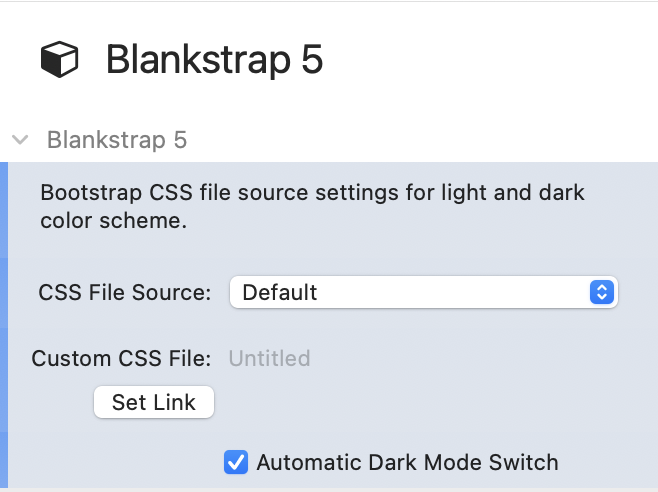
Themes are based on a bootstrap CSS file. This can be set inside the Blankstrap Core stack.
Predefined Bootswatch Themes
In order to apply predefined Bootstrap themes, you could for example download them from Bootswatch.com.
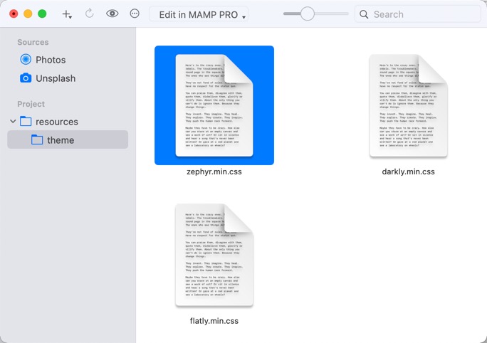
Navigate to a theme, e.g. Zephyr, and download the bootstrap.min.css file.
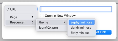
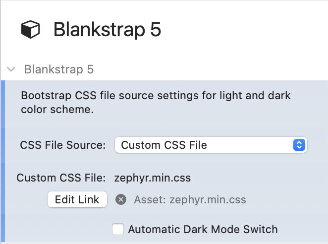
Add this file to the RW resources and link it inside the Blankstrap 5 core stack. The updated styling will be visible in preview mode and when published.
Build Your Own Theme
Building your own theme is easy using services like Themestr.app or Bootstrap Build. These allow you to build you own theme in various steps. Download the generated Bootstrap CSS file and reference it like shown above.
Dark Mode
Switching to a dark mode theme is by default turned on. You are able to turn it of inside the Blankstrap Core stack. You are able to select a standard supplied dark theme or a custom theme. The custom theme must support Bootstrap 5.3 dark mode.
If the device is set to dark mode is evaluated by the standard CSS media query @media (prefers-color-scheme: dark). Read more about this media query here.
Further Styling
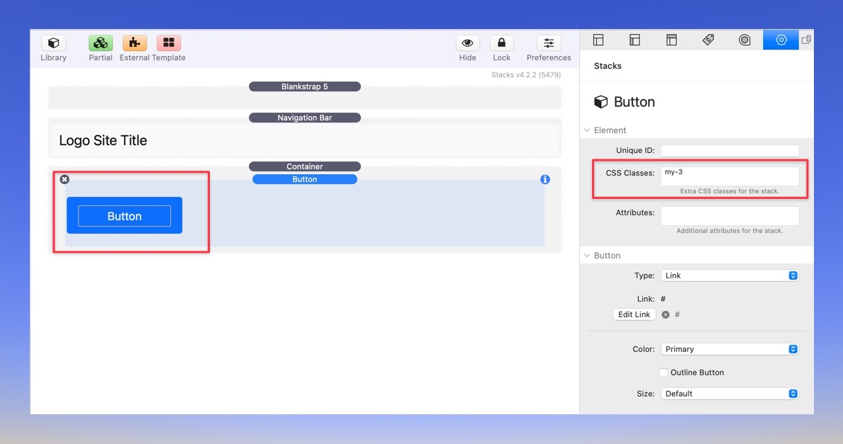
In oder to style the different components coming with Blankstrap, knowledge about Boostrap styling and usage of Bootstrap styling classes is required. Each component contains a CSS input field in oder to apply CSS classes, for example margin or padding styling. The following example applies a vertical margin 3 on a button (my-3). More information about Bootstrap styling classes can be found in the official documentation of Bootstrap 5.
Still youre able to use other stacks and theri inbuild functionality for styling. Using the Blankstrap stacks is not required.
inStacks Software
Imprint
Privacy Policy
Contact
Twitter
BlocsAddons / Volt CMS
© Futural UG (haftungsbeschränkt)